Pro Painter USA
MILWAUKEE WI, USA,
November 6, 2026


The best home office color isn’t always the brightest. Home office painting ideas that support concentration often begin with soft blue, green, or warm gray, while a pale neutral can make a darker room feel brighter. Blue is versatile, but natural light and paint finish both affect how it looks on the walls.
Choosing a color can be challenging when a paint sample looks different in daylight than it does under a desk lamp. Consider the room’s light, the mood you want, and how much reflection feels comfortable.
Here, you’ll learn how to narrow down a color, why blue walls can work well, and how lighting changes the result. You’ll also compare matte and eggshell finishes to choose a look that feels comfortable and practical for your workspace.
• Choose a wall color to suit the work and mood you want, with soft blues, greens, and warm neutrals among the options to consider.
• Account for the room’s natural light, which can change how paint appears and make some finishes feel more reflective.
• Compare matte’s soft, low-glare look with eggshell’s added light reflection and easier cleaning.
• Use blue thoughtfully: its shade, the room’s lighting, and nearby colors all shape the final effect.
The best home office color depends on your work and the atmosphere you want. Soft blues, warm grays, and greens are useful options for detail-oriented tasks, while gentle neutrals create a versatile backdrop. Start these home office painting ideas by matching the color to the room’s light, furnishings, and daily use.
For a bright, calm workspace, consider an off-white or pale taupe. Little Greene’s Joanna is an example of a pale taupe scheme; a vivid chair or rug can add contrast without covering the walls in a strong color. Benjamin Moore’s Ballet White OC-9 and White Heron OC-57 are other named options. In a darker office, creams and light taupes can help the space feel more open and welcoming.
To coordinate paint with your furniture, pick a color already found in a desk, bookcase, rug, or artwork. Neutral walls can tie together different wood tones, while green walls can echo plants or a patterned rug with green details. For more energy, try a warm color on one accent wall instead of every surface. A deeper shade can make a study feel intimate; balance it with lighter furnishings or a pale ceiling.
For a 2026 palette, consider colors such as Beneath the Clouds 2131-50, Sunlit Coral 2170-60, or Cushing Green HC-125. They offer different directions, from subdued to lively, without requiring one color to suit every office.
For low-VOC or odor-free paint, choose a product whose label specifically identifies it that way. The terms aren’t interchangeable, so rely on the exact claim on the product label rather than assuming one means the other.
Before settling on a shade, view a sample beside your desk and largest piece of furniture. Compare it in daylight and under your evening lighting, since the same paint can look different as the light changes.
Natural light changes how a painted wall looks throughout the workday. Its direction and amount can make the same color appear different from one wall to another. A wall beside a bright window, for instance, may look lighter than a shaded wall across the workspace. Greens and other muted shades may look softer in one spot, then more pronounced as daylight shifts.
Assess the room’s light before choosing a paint sample. Note which walls receive direct sun, which stay shaded, and where your desk sits. A sample beside the desk shows how the color interacts with your screen, shelving, and task lamp. Rather than seeking a perfect shade under one lighting condition, look for one that feels balanced in the conditions you use most.
Direct light also affects sheen. Semi-gloss reflects more light, so a wall facing strong sun may create distracting glare. That reflection can compete with a monitor or shine into your line of sight. In that situation, a less reflective finish can help keep attention on the work surface. Save glossier paint for details instead of broad, sunlit walls.
Artificial lighting adds another layer. A warm desk lamp can make a neutral wall feel warmer, while cooler overhead lighting can make it look sharper. Review the sample beside your desk with the lights you use for evening work switched on. Then consider whether the wall color works with your actual setup, including a dark monitor, light desk, or wood bookcase.
Lighting can also guide the placement of color. A shaded wall may benefit from a lighter-looking shade, while a naturally bright wall can carry a deeper tone without dominating the room. Keep the sample visible beside the main furniture as you assess it. If uneven wall surfaces complicate the finish, a carefully painted workspace can help the chosen color appear more consistent.
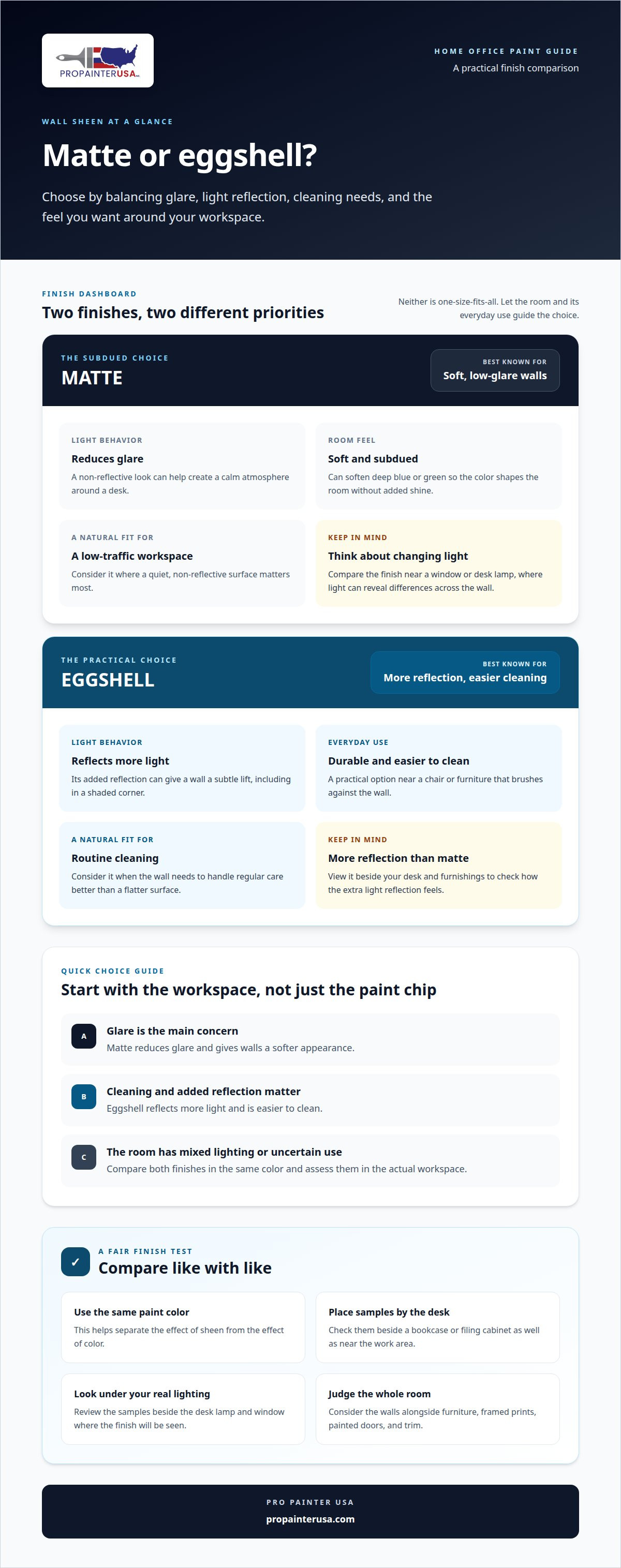
Matte and eggshell are popular wall sheens for home offices, according to Benjamin Moore. Matte paint reduces glare and gives walls a soft appearance, which can help create a calm atmosphere around a desk. Eggshell reflects more light while offering durability and easier cleaning. Choose based on the room’s light, daily use, and the look you want.
For a low-traffic workspace, matte can suit walls where a quiet, non-reflective surface matters. It can also soften the appearance of deep blue or green, letting the color shape the room without added shine. Consider how matte looks beside a desk lamp or near a window, where changing light can reveal differences across the wall.
Eggshell is a practical choice if you want a little more light reflection and a finish that’s easier to clean. It can work well behind a chair or near furniture that brushes against the wall. For example, pale neutral eggshell can keep a compact office feeling open and handle routine cleaning better than a flatter surface.
To choose between the two, compare both finishes in the same paint color. Place samples near the desk, then view them beside a bookcase or filing cabinet. Matte looks softer; eggshell catches more light. Comparing them side by side helps separate the effect of sheen from the effect of color.
Think about the whole room, not just the walls. Matte walls can pair with framed prints or textured furniture, while eggshell can add a subtle lift to a shaded corner. If the office has painted doors or trim, a different sheen can distinguish those details from the walls.
Either finish can transform your workspace without changing the furniture. Choose matte for a subdued, low-glare feel or eggshell for more reflection and easier cleaning. In a lightly used study, both provide a smooth foundation for the colors, lighting, and furnishings that define the room.
Blue is a strong choice for a workroom because soft blues can support concentration during detail-oriented tasks. The key is choosing a paint color that suits the room’s purpose, rather than assuming every blue creates the same effect. Muted blue can give a small workspace a quiet backdrop, while a stronger shade makes the walls more prominent.
Start by deciding how much blue you want. Painting every wall creates an enveloping look; using blue on one wall adds definition while keeping the rest of the room neutral. For example, place blue behind a desk or bookcase, then use warm white on adjoining walls. This keeps the color central without making it compete with papers, screens, or artwork.
Pair the shade with the room’s fixed features. Blue works well beside pale wood, white shelving, or charcoal desk furniture. Add a small energizing contrast with a coral cushion, a warm-toned lamp, or artwork with red details. Keep accents limited so blue remains the main color, not one voice in a crowded palette.
Consider the difference between pale and deep blues. Light blue gives a restrained, open impression; darker blue creates a more cocooning setting. If the room has little natural light, balance a deep wall with lighter furnishings or a pale ceiling. In a brighter room, richer blue can give the work area a defined visual anchor.
Use a sample to judge the shade beside the desk and any large furniture, then view it under daytime and evening light. Benjamin Moore lists Beneath the Clouds 2131-50 among popular home office paint colors, offering a named reference point as you compare blues. A focused blue palette can make the office feel intentional without requiring a full room redesign. To carry your preferred blue through the room, plan a blue interior paint project with a clear wall and accent-color scheme.
Pro Painter USA helps bring your home office color and finish choices together through residential interior painting. Whether you’ve settled on a calm blue, a light neutral, or a contrasting accent, a professional paint application can give the workspace a considered, cohesive look.
Turn to Pro Painter USA when you’re ready to move from choosing colors to updating the room. Share the shades and finish you have in mind, along with the walls or details you want painted. You’ll have a clear plan for refreshing your office without taking on a larger renovation.
For a home office that better suits your work and surroundings, contact Pro Painter USA to discuss your painting project.
Let the finished room support the way you work, rather than simply follow a color trend. A considered choice can make your office feel personal and comfortable, whether you prefer a quiet backdrop or a more expressive setting. Use these home office painting ideas as a starting point, then choose a direction that fits your space and routine.
When you’re ready to move from planning to painting, Pro Painter USA provides Residential and Commercial Interior Painting, Residential and Commercial Exterior Painting, and commercial interior painting. For a home office refresh, Residential and Commercial Interior Painting can bring your chosen color and finish together for a cohesive result.
Contact Pro Painter USA today to discuss your painting project. Take the next step toward a workspace that feels considered, welcoming, and ready for the work ahead.
The best color supports your tasks and works with the room’s existing furnishings. For a screen-heavy setup, a restrained shade can keep the walls from competing visually with your monitor. If you use the office for creative work, a warmer accent can add personality. Consider your desk, shelves, and artwork together before choosing a palette.
Soft blue, warm gray, green, and pale taupe are versatile starting points for a home office. Choose based on the furniture and mood you want, rather than relying on a paint chip alone. For example, gray-green can connect a wood desk with leafy plants, while muted blue can complement white shelving and simple black accessories.
Color shapes the atmosphere you experience while working, but no wall shade can guarantee better focus. A quiet palette may feel less visually busy during detailed tasks, while a small area of brighter color can bring energy to a creative workspace. Keep the area behind your monitor visually calm, and use artwork or desk accessories for stronger color.
Matte or eggshell can suit office walls, while semi-gloss can make trim and doors stand out. Consider how often each surface gets touched: a door near the desk may benefit from a finish that handles routine cleaning, while an undisturbed wall can prioritize a softer look. Using one trim sheen throughout helps coordinate window frames and doors.
Choose an accent wall that gives your desk or another feature a clear visual anchor. A warm shade can introduce energy, while deeper blue can define the work area. Before deciding, consider what sits in front of the wall, such as a bookcase or framed art. Keep nearby decor simple so the accent remains the focal point.
In a small or dark office, use a light wall color to make the room feel more open, then limit stronger shades to a small accent or decor. A pale ceiling can help maintain a continuous, airy impression. If a dark desk or bookcase dominates, lighter walls nearby create contrast and keep those pieces from visually crowding the workspace.
You might find these helpful:
We are a team of interior and exterior painters and we are not limited to house painting only. We can paint different businesses like retail shops, commercial buildings, and apartments.
We also provide restaurant painting services. We can give you more information about these services if you give us a call.