

Pro Painter USA
MILWAUKEE WI, USA,
October 30, 2026


Blue is a strong starting point for dining room painting ideas in 2026: pair deep blue with gold accents for a dramatic look, or choose dusty blue for a softer, more casual feel. Teal can shift in appearance as the light changes, so its effect depends on the room as well as the shade.
It makes sense to weigh paint colors against the furniture and finishes already in the room, especially when antiques or dark wood are part of the plan. The right pairing can bring those pieces forward while helping the dining area feel connected to the rest of the home.
Explore ways to coordinate color with antiques, define an open dining space, and use muted olive, sage, or blue with confidence. You’ll find practical combinations, plus guidance on where a stronger shade can make an impact and where a quieter backdrop may work better.
• Start with the antiques, wood tones, fabrics, and artwork already in the room, then choose a wall color that complements rather than competes with them.
• Use an accent wall to distinguish an open dining area, while relating its color to nearby spaces for a more connected feel.
• Consider muted olive or sage for an earthy, understated palette, and pair green shades with natural materials or wood finishes.
• Compare blue options in the room’s changing light; deep blue with gold accents feels dramatic, while dusty blue offers a softer direction.
Begin with the room’s fixed features: antique wood, upholstery, artwork, and existing accessories. According to Benjamin Moore, these elements can guide dining room paint selection. With dark wood, consider olive green for grounded contrast or warm white for a lighter backdrop. Creamy white can also balance colorful chairs and a wallpapered ceiling. A neutral such as Agreeable Gray is another option when you want the room to feel brighter and more open. In a small dining room, warm white or greige creates an airy background; use furnishings and artwork to add stronger color.
Choose the finish based on the surface and how the room is used. Eggshell or satin is a practical choice for dining-room walls, while semi-gloss helps trim stand apart and is easier to wipe clean. A flat ceiling finish keeps attention on the walls and furnishings. If you want low-VOC or washable paint, choose an interior paint labeled for that quality and compare the product label with your cleanup needs. Test the color beside an antique cabinet or fabric rather than judging it on its own.
In an open-concept home, a charcoal accent wall or color-blocked section can define the dining zone without a physical divider. Relate the shade to a color in the adjoining living area, such as a shared neutral or softer blue. Connected rooms don’t need identical walls, but a shared undertone helps the palette flow. For a bold effect, deep red creates a dramatic atmosphere; try it on one wall for a more contained change.
Lighting changes how paint reads, so assess samples in morning and evening light. A north-facing room can make some shades appear cooler, while stronger direct light may bring out warmth. Deep teal can shift as light changes, making a sample useful before committing. For color-drenching, carry Mazarine blue across walls and woodwork; for a dramatic purple scheme, use Córdoba as the backdrop with contrasting accents. These dining room painting ideas in 2026 help balance antiques, architectural details, and open layouts. If you are taking on a broader space transformation where architectural details and wall colors are designed together, interior design and fit-out firms like Right Solution Contracting LLC offer helpful inspiration for balancing color with bespoke finishes.
Open-concept dining areas need a visual boundary, but not necessarily a wall. Benjamin Moore recommends using paint to distinguish a dining nook from adjoining rooms. Start by identifying the zone’s natural edges, such as the table, pendant light, or a flooring change. Then choose one wall or a contained color-blocked area to make the dining space feel intentional. A charcoal accent wall can separate it visually without adding a physical divider.
Create continuity through undertones rather than matching every wall. A dining room can be deeper in color than the living room, while shared warm or cool notes tie the spaces together. For example, pair a muted blue dining nook with pale neutral walls nearby, then repeat the blue in a cushion or artwork. If adjoining rooms already have strong colors, choose a softer dining-room shade and reserve contrast for trim or a painted panel. This defines the table’s setting without making the open plan feel chopped up.
Consider sightlines before choosing a feature wall. A wall behind the dining table often creates a clear focal point, while one visible from the entry can draw attention across the open space. Test a sample in both locations to see how the shade relates to nearby furniture and finishes. A dark accent can feel substantial, so balance it with lighter surfaces or furnishings in the same view.
For a bolder approach, color-block the dining nook with a defined band or painted section, keeping the boundaries aligned with architectural details. In a compact open layout, a single colored wall may provide enough definition; a larger space can carry a stronger contrast. Deep Mazarine blue across the walls and woodwork creates a more enveloping effect than an accent alone. For a composed dining-room repaint, professional interior painting can bring the selected color scheme onto the walls and trim.
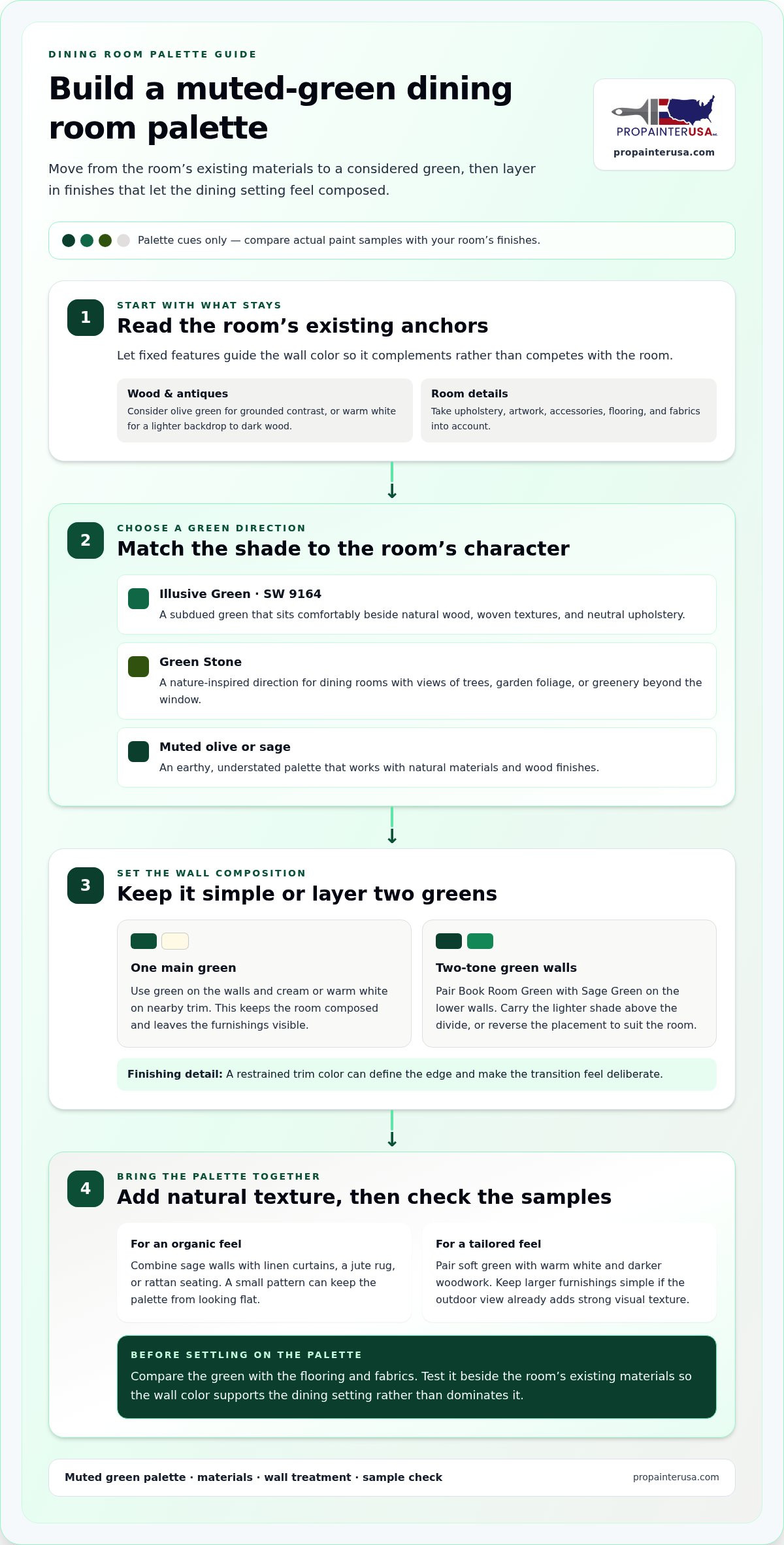
Muted green brings an earthy dining-room palette without the intensity of brighter shades. Sherwin-Williams Illusive Green, identified as SW 9164, offers a specific shade to consider. Its subdued character can sit comfortably beside natural wood, woven textures, and neutral upholstery. To keep the room composed, choose one main green for the walls, then use cream or warm white on nearby trim. This approach leaves the table, artwork, and lighting visible without competing color blocks.
For a layered wall treatment, pair Book Room Green with Sage Green on the lower walls. The contrast distinguishes the lower section while keeping both tones in a related green family. Carry the lighter shade above the dividing line, or reverse the placement if it better suits the furniture and wall proportions. A restrained trim color can define the edge and make the transition feel deliberate.
Green Stone is a useful direction for a dining room with outdoor views. A nature-inspired shade can connect the room visually with trees, garden foliage, or greenery beyond the window. Repeat the color in a small detail, such as a ceramic vase or patterned seat fabric, to integrate the wall color. Keep larger furnishings simple if the view already adds strong visual texture.
Muted greens also pair well with natural finishes. Try sage walls with linen curtains, a jute rug, or rattan seating for an organic feel; add a small pattern to keep the palette from looking flat. For a more tailored scheme, combine soft green with warm white and darker woodwork. Compare the green with the flooring and fabrics before settling on the full palette. These pairings let the wall color support the dining setting rather than dominate it.
Blue can bring a quieter, more composed mood to dining spaces, while still offering striking contrast. Sherwin-Williams Sensible Hue, code SW 6198, is one named option for a restrained blue-green direction. Blue-gray is another choice when standard gray feels too cool; its blue undertone adds warmth. Match either shade with light wood and neutral fabrics for a balanced setting, or use darker furniture to strengthen the contrast.
Deep teal deserves extra attention because its appearance can shift with changing light. View a sample beside the dining table and flooring in daylight and evening light. Notice whether it looks bluer, greener, or more subdued at different times. This comparison can help you decide whether to use teal throughout the room or limit it to one wall, especially if the light varies.
For south-facing dining spaces, consider Canton, a vibrant teal recommended for that orientation. If you prefer a softer look, Aleutian’s dusty blue suits contemporary and casual settings. Blue Verditer can work with natural materials such as wood or woven textures, while contemporary accents keep the palette from feeling overly traditional. Choose supporting finishes to suit the blue’s intensity: pale accessories soften a saturated wall, while deeper tones create a more defined scheme.
For a dramatic focal point, an inky blue with a high-gloss finish adds depth and pairs elegantly with gold accents and a chandelier. Keep the table setting and nearby finishes simple enough to let that combination lead. If a full room of deep blue feels too strong, use the shade on a single wall and repeat a small blue detail elsewhere. To carry a chosen blue palette onto your dining-room walls, plan a professional interior repaint.
Pro Painter USA provides Residential Interior Painting for homeowners ready to put a dining-room color plan into practice. Whether you’ve settled on sage, layered blue, or a bold accent wall, professional painting can carry the chosen palette across the room with careful attention to the walls and surrounding details. It’s a practical next step once you’ve chosen your colors and want a cohesive finish.
For a dining room refresh, consider the wall color alongside trim, doorways, and adjoining spaces. A coordinated plan can help the dining area feel distinct while maintaining visual flow through the home. Contact Pro Painter USA to discuss your interior painting project.
A lasting dining-room scheme starts with a color decision you can carry through the space. Before painting begins, settle on the wall color and note how it relates to trim, doorways, and the rooms visible from the table. This simple plan helps the finished look feel intentional, whether your chosen direction is subtle or expressive.
Pro Painter USA offers Residential Interior Painting for home updates, as well as Residential Exterior Painting and Commercial Interior Painting. For a dining room project, the interior painting service can bring your selected color plan to the room’s surfaces with a consistent finish. If you know the direction you want, discuss the project and the atmosphere you hope to create.
Contact Pro Painter USA to discuss your project, and take the next step toward a dining room that feels distinctly yours.
Popular directions include earthy greens, nuanced blues, warm neutrals, and selective use of saturated color. For dining room painting ideas in 2026, consider Indian Yellow with colorful flooring and Hopper on the woodwork for a lively, layered scheme. If you prefer a quieter foundation, keep most surfaces neutral and concentrate a stronger shade on one architectural feature, such as the ceiling or built-in shelving.
Chocolate shades can create a coordinated backdrop with wooden furniture, including when the walls and woodwork share the deeper color. For lighter contrast, compare the wood’s undertone with warm white or a soft neutral before choosing. A floor with orange or red notes may look different beside cool gray than beside creamy neutral, so assess the full palette together.
For a mural-led scheme, pair a design in the Soleil colorway with Pale Lime walls and Puck woodwork. This gives the mural a defined setting while carrying its palette onto another surface. Color drenching creates a different effect by extending one shade across walls and trim. An accent wall keeps a stronger color contained, making it a practical way to try a bolder direction.
In Milwaukee-area open-plan homes, use a fixed feature, such as kitchen cabinetry or living-room flooring, as your starting point. Choose a dining shade that shares an undertone with that feature rather than copying its exact color. Then identify where the dining area begins, such as at a flooring change or beside the table, and use paint to mark the transition without competing with nearby finishes.
Choose an interior paint labeled low-VOC or washable, then compare its product label with your cleanup needs.
Test the color beside furniture or fabric, and check it in morning and evening light. Choose eggshell or satin for walls, semi-gloss for trim, and flat for the ceiling. Professional interior painting from trusted home maintenance providers like Sar Deen Engineering Pte Ltd can bring the selected scheme together.
You might find these helpful:
We are a team of interior and exterior painters and we are not limited to house painting only. We can paint different businesses like retail shops, commercial buildings, and apartments.
We also provide restaurant painting services. We can give you more information about these services if you give us a call.


